After previous reflection on my portfolio and self branding, I have decided that I will move forward with creating a typeface for myself.
I have decided that I wan to use it for headings, dates, and an identity. I also want to include a hand rendered element to the design, and perhaps have a digitised hand rendered typeface as it shows my interest in hand drawn typography as well.
I went through styles of typefaces and decided that I would make a Slab Serif style typeface. It isn't quite as formal as a Roman serif typeface, but also has a bit of individuality to the typeface.
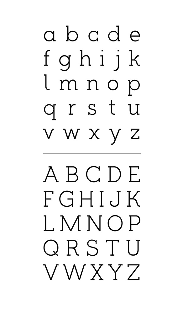
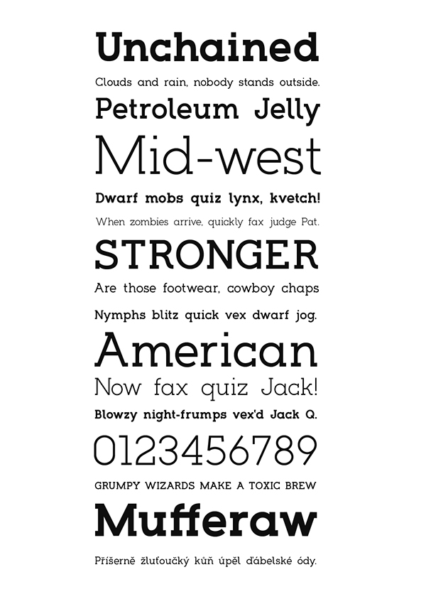
With this, I looked at a variety of Slab Serif typefaces. Below are the ones I particularly like.
Choplin


Hapna
ALEO


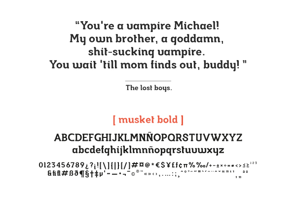
Musket
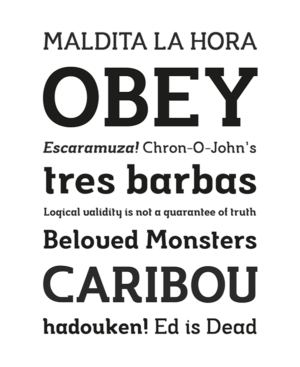
Timber
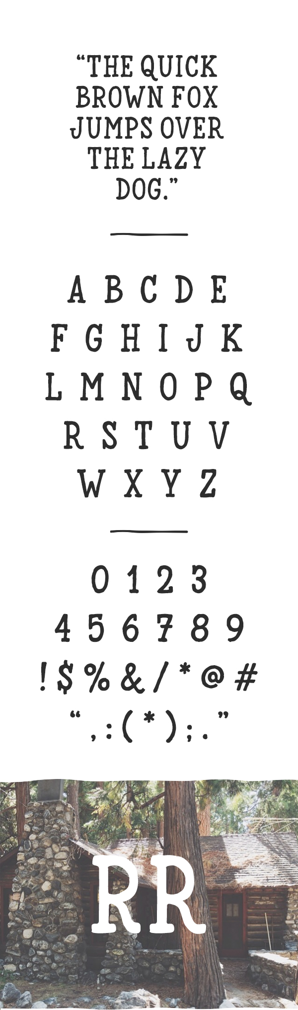
Kelvin
I collected a wide range of Slab Serif typefaces/logos and put them all on a document, printing it out so I could go through it in more detail and pick out the attributes of each letter that I like. I have found that when I use a typeface, there's always a letter or two that I really don't like, so I really want to make an effort to accommodate my personal tastes in letters while keeping it uniform and consistent.

Points I want to use:
- The middle of the 'M' must not touch the base line. Vice Versa for the 'W'
- The font must not be wide like 'Sedgwick' (Above)
- 'Romanesco' is a good proportion
- I like the idea of serifs being on the outside of the letter instead of both sides
- A bit of character of the curves (R & Q marked above)
- The 'O' and '0' must be different
- The 'N' shouldn't have serifs on the top left or bottom right
- A semi-bold to bold weight ('unchained')
- An Ampersand will be needed (Wheatless & More Client Project)
- Uppercase
- Would prefer a fully round 'O'
- Don't like the serif on the top of the 'A'
- No serif on the end of the cross bar ('E' & 'F')
- 'U' and 'V' must be visibly and very clearly different
- 'B' bowls must be symmetrical
After deciding on these factors I decided on making a start by hand. I want to draw out every letter by hand and then digitally alter them so they are more consistent.
I started by drawing a grid, deciding on 4x4cm, with the thickness being 5mm. There is also an extra 5mm on either side for serifs. Having a square grid means that 'O' will be a perfect circle, and 'X' will be a square.

I initially started with the idea of the letterform filling the 4x4 space and having the serifs in the 5mm outside this.
I also wanted an individual serif shape, so instead of having just a straight slab serif, I want an angle to it.

I tried both of these as shown above, however I think that the letters are too wide. While the 'H' and 'N' seem to work well, letters such as the 'X' and 'Y' just don't seem to work so wide. I am also a bit concerned about the style of serif on the letters with diagonals. Once again it works well on the straight letters (H & N) but doesn't work so well on the other letters (X, V, Y). This is because the diagonal of the letter changes the point where the serif bottom meets it. Also the serif size on these letters are different to those like 'H', which is something that I need to really consider.
I did briefly try the idea of having the serif go 5mm from the edge of the diagonal, as shown below, however this made the serif look overly big in comparison to the others, and overall it just doesn't sit right with the character.

I also tried the idea of having a thinner serif. Three variations of serifs are shown in the 'Z' below, with the thinner serif shown on the other letters.
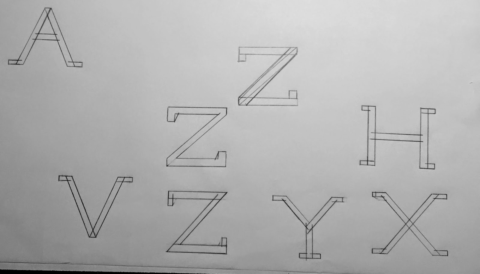
I then tried it with the thinner serif with a diagonal as well, as shown below. However I much preferred it with the thicker serif and diagonal.

After settling on the thicker serif and diagonal I drew out each of the letters to the grid. I expanded it for the 'M' & 'W', and made it smaller for 'I' & 'J'. All other letters were made to fit the grid.
For the 'Q', I added a unique tail instead of having it just a diagonal across the bottom right. I really like how this worked as originally I was a bit unsure.


As I drew these on layout paper, I photocopied them onto a thicker stock so I could create the block shapes without affecting the paper and letterforms.
%2B1.png)
%2B3.png)
%2B2.png)
.png)
.png)
I then scanned these into the computer and turned them into vectors on Illustrator.

There are clear issues in terms of line width and serif size. While I initially wanted the hand drawn feel to the typeface, I am unsure about it now seeing it vectorised. I feel that it just looks unprofessional like this and perhaps something more digital and clean would look better.
I then went through a few stages of change before finally settling on what I was happy with.
Stages of change:
The first thing that was immediate was that while I had drawn the majority of the letters to the same width, this is not the case in the majority of typefaces, and some letters would benefit from looking thinner. As this is my attempt at creating a typeface that I am happy with in all aspects, I needed to edit letters in the way which I thought worked best. Letters such as 'E' 'F' and 'P' were made thinner in width.
The line weight for letters with diagonals was also an issue that needed to be altered digitally. This is clear in the 'Y' shown above, where the arms of the 'Y' are much thinner in the hand rendered design than in the final design. I wanted the weight to be consistent across all elements of the letter anatomy.
In terms of the serif style, I tried a variety of styles both by hand and digital, and as I created the typeface over a number of days, by the time I had it digital and was on the finishing stages, I found that I much preferred the straight serif as it works well with all the letters and doesn't have the issues that the diagonal serif does with letters such as 'Y'. This is shown clearly above. I also wanted to use the idea of the serif being just on the 'outside' of the letter (Look at 'M'), so decided to keep this as a uniform trait across all letters that needed a serif. While I initially had serifs on both sides of the base in letters such as 'P' and 'F', I like the individuality of the serif to one side. It shows that I have considered the overall look of the typeface and not changed the serif use depending on the letter.
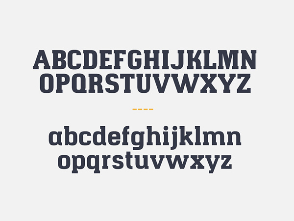
Finished typeface:

While I had initially wanted to create a hand rendered typeface, I do think that the final typeface is far superior to my hand drawn designs. I do think I can say that it has kept true to what I wanted because the hand drawn process is wha really aided the design of this typeface. It gave me a much greater understanding of how the letters work on their own and with others in terms of width, spacing and serifs.
Overall I think the typeface has turned out really well and I am pretty confident that the letters are all individually strong and it works well as a typeface. The serif to the left has really grown on me and I think it is something that differentiates it from any other slab serif typeface. I also did eventually include a serif to the top of the 'A'. I initially didn't like this in other typefaces, however I think it works really well in this typeface.
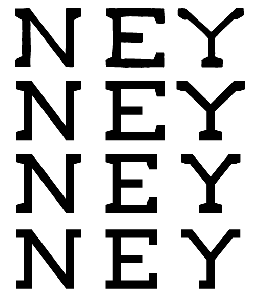
Typeface is use:


No comments:
Post a Comment