The PPP module has never been one which I have enjoyed in the previous years, however I think the self-directed development in this module is definitely something which has benefitted me. I definitely think PPP has become so much more useful this year and has helped shape me as a designer and not be afraid of going out and continuing a future in design.
Moving into third year I was very set on developing my self branding straight away as it was something that I was very unhappy with in the first and second year. I think this year I really realised how important it is and how it can be used. Previously it was just something to complete the module, but now I see it as a key component to my practice and representing myself as a designer. Developing this from the beginning of the year allowed me to try a huge variety of ideas and be able to create the end products which I am very happy with and feel are strong.
This module is also the push I needed to get a placement and start engaging with the industry. My two week placement at Cool Beans Creative was hugely enjoyable and made me realise how much I enjoy working in Web and App design. I think that this placement was a turning point for my design practice. Before going on this placement I hadn't been particularly confident in web/app design, and in this placement I was doing it every day, and developed my skills in this area a huge amount to the point where I am very confident in my ability in this area now, to the point where I have completed a second App project in my Extended Practice.
The main negative in this module is that I don't think I engaged with the industry quite as much as I would have liked to, and it is definitely something I regret. I have seen how positive engaging is and will definitely think about this as I move forward.
Overall I have found this module to be enjoyable because of how self-directed it. I think that I have grown as the module has progressed and I have a very clear idea of the way I want to represent myself and the work that I want to do.
Friday 22 May 2015
Wednesday 20 May 2015
Tuesday 19 May 2015
Friday 15 May 2015
OUGD602 - Website
An element to my self branding which I have not done yet is the creation of my proposed website. At this point I do have a Cargo Collective website, and I am in the middle of making that my permanent online presence, updating it with all of my new work before it goes live.
Before getting the Cargo and paying the money to get my own domain name for that, I did look into building my own website, however I felt that I did not have enough experience in website building to be able to do this successfully. Instead, I will work on the proposed website and hopefully in the future this can become a reality.
Second year website
To begin this process I looked over the website I proposed for my previous self branding at the end of second year. It's fair to say that I don't like it at all now and think it's quite childish, and just doesn't look professional at all. It definitely is not reflective of me as a designer anymore.


The main difference in my design from this time last year is that I have been able to refine my skills a lot more, particularly in web design, where I now feel I am excelling at and learning to improve on that every day. With this in mind, I decided on completely scrapping everything I did for the second year and starting fresh.
I wanted a really simple layout with large space for imagery and a consistent approach across all pages.
Development


Final Designs

Homepage - I wanted this to be really simple and for the top image to flick through images of my work, giving the viewer a taster of what I do. Below this is a short summary of my design practice. The latest work bit is something just so the viewer can see the most recent work and be able to click on these immediately.

Projects - I decided on a really simple layout in the end, removing the additional information of the date and tags. I think it works really well with just the thumbnails and project titles. It's clean and simple, and I think the choice of typeface works really well here.

Individual Project - After trying a variety of designs for this page, I settled on this one because it is consistent with my branding and the previous pages. The text at the top and imagery below means that the viewer can look through all the imagery together. I also think the layout variation of one large or two side by side images works well and this is something to keep consistent through these pages I think.
Overall I am really happy with the way this final website proposal has turned out. I think it is much more professional than my previous attempt, and the white space works really well in creating a clean and consistent layout and experience. It works really well alongside my branding as well, and I hope that I can have this built some time in the future.
Monday 11 May 2015


Sunday 3 May 2015
OUGD602: Studio Brief 2: Extending the Branding
To complete my personal branding and promotion, I thought about what I already had and what else I needed to create a well-rounded approach.
Currently I have the following:
Currently I have the following:
- An identity - bespoke icon & bespoke typeface
- An A3 Portfolio
- A coptic bound portfolio
- Business Cards
- Website - Run on Cargo Collective (+ Personal Domain)
- Behance
Overall I have a variety of things which to an extent do promote me, but there are a couple of other things that I definitely need in moving forward in networking etc.
A CV - When looking at design studios for their requirements for applications, a lot require a portfolio and a separate CV. At the minute, my CV is included in the portfolio, so I need to create a simple document which is just the CV. This also needs to be updated with comments that have been made previously.
A mailout - This will be instead of the coptic bound portfolio. The coptic bound portfolio is large, and with the stitching, it means that it can't be freely updated easily like the A3 portfolio. As something small to send out to studios, a mail out with maybe four or five projects in, instead of the amount in the A3 portfolio will be much better. As it is small it will be easier to work with and change when necessary.
Stationary - A selection of letterheads, invoices etc need to be created. To have a web version of these will also be good as not all clients will be in reach of a paper copy.
Realistically, these are the only three things that I need to complete my professional brand. It seems a bit wasteful to brand other items when its not necessary.
With the portfolio I previously created - the coptic bound one - I had chosen a new identity marker for myself. This is something that I am still happy with, and with a bit of editing, I have decided to continue to use it.
At this point I have also developed a sans serif version of the typeface previously used, so I will be using that from now on instead of the slab serif version. It looks a bit more professional as it is a cleaner and more consistent design.
I have also decided on a brand colour of grey to go with the black logo. It's quite professional and I think it works really well with the logo.
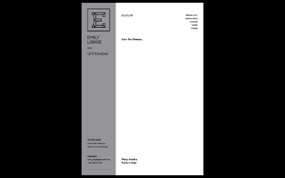
CV
For the CV I wanted a very simple layout, and while developing this I found that I really liked the use of a 'side bar' as it were - a strip of the grey along the left hand side where the branded information and contact information would be. It's something quite different to what I have done in the past.

Mail Out
I wanted the mailout to follow the same appearance as the CV in being a structured layout. The main thing for the mailout is that I wanted it to be easily changeable when it comes to the projects in it. To do this, I decided on a very simple layout with switches for each page turn. The grid is also simple so the image spaces can be changed depending on the project.
For this mailout I decided on including projects that showed a variety of skills.
Digital Version:
Stationary
Now that the CV design has been completed it is just a case of applying this to the stationary items which I need - a letterhead and invoice.


With the portfolio I previously created - the coptic bound one - I had chosen a new identity marker for myself. This is something that I am still happy with, and with a bit of editing, I have decided to continue to use it.
At this point I have also developed a sans serif version of the typeface previously used, so I will be using that from now on instead of the slab serif version. It looks a bit more professional as it is a cleaner and more consistent design.
I have also decided on a brand colour of grey to go with the black logo. It's quite professional and I think it works really well with the logo.
CV
For the CV I wanted a very simple layout, and while developing this I found that I really liked the use of a 'side bar' as it were - a strip of the grey along the left hand side where the branded information and contact information would be. It's something quite different to what I have done in the past.

Mail Out
I wanted the mailout to follow the same appearance as the CV in being a structured layout. The main thing for the mailout is that I wanted it to be easily changeable when it comes to the projects in it. To do this, I decided on a very simple layout with switches for each page turn. The grid is also simple so the image spaces can be changed depending on the project.
For this mailout I decided on including projects that showed a variety of skills.
Digital Version:
Stationary
Now that the CV design has been completed it is just a case of applying this to the stationary items which I need - a letterhead and invoice.


Something extra that I decided on adding is an A5 pad of paper with lists for every day. This is due to the fact that I like to write lists of things to complete for a specific piece of work or to complete in a day. It's something that reflects my design practice.

Friday 1 May 2015
OUGD602 - Studio: Parallax
Parallax is a web design agency based in Leeds and London. I first came across them because I saw on the Thompson Brand Website that they are the ones who built it.
Website
I really like the look of this agency because it's really contemporary and was only established in 2010, so it's current. With it being fairy new, I was surprised to see they had quite large clients, such as British Airways, East Coast and Dyson.
British Airways

Nespresso

I think its clear that this is a really innovative and creative agency, and it also seems really friendly too, which is a plus.
I noticed they have a job up for a UI/UX designer in Leeds, and I think that this would be something really good for me to apply for, especially following how much I enjoyed working in this area on my placement at Cool Beans.
Website
I really like the look of this agency because it's really contemporary and was only established in 2010, so it's current. With it being fairy new, I was surprised to see they had quite large clients, such as British Airways, East Coast and Dyson.
British Airways
We created software allowing BA to load and change their advertising visuals on huge LED billboards remotely. The software runs on a Mac Mini for each billboard and campaigns can be scheduled with minimal updating.
This software includes a web app which detects if there are any issues with the displays, sending a text message should any of the billboards fail so that any issues can be corrected promptly.
Nespresso
We worked with Nespresso’s existing assets to create something in line with their current brand guidelines, which would help them stand out and draw in crowds above the multiple brands competing for attention at the event.
We flew out to Berlin to install the iPads at the Nespresso stands in person, located next to their range of exciting products. The visitor feedback was that the app really added wow factor to Nespresso’s display.
I think its clear that this is a really innovative and creative agency, and it also seems really friendly too, which is a plus.
I noticed they have a job up for a UI/UX designer in Leeds, and I think that this would be something really good for me to apply for, especially following how much I enjoyed working in this area on my placement at Cool Beans.
Subscribe to:
Posts (Atom)